Brand
The wordmark, the dot, three colours and two typefaces. Everything here is free to use when you talk about Monova; please do not alter the marks.
Wordmark
Six lowercase letters with the second o replaced by the dot. The letters take the colour of the text around them; the dot is always coral.

Icon
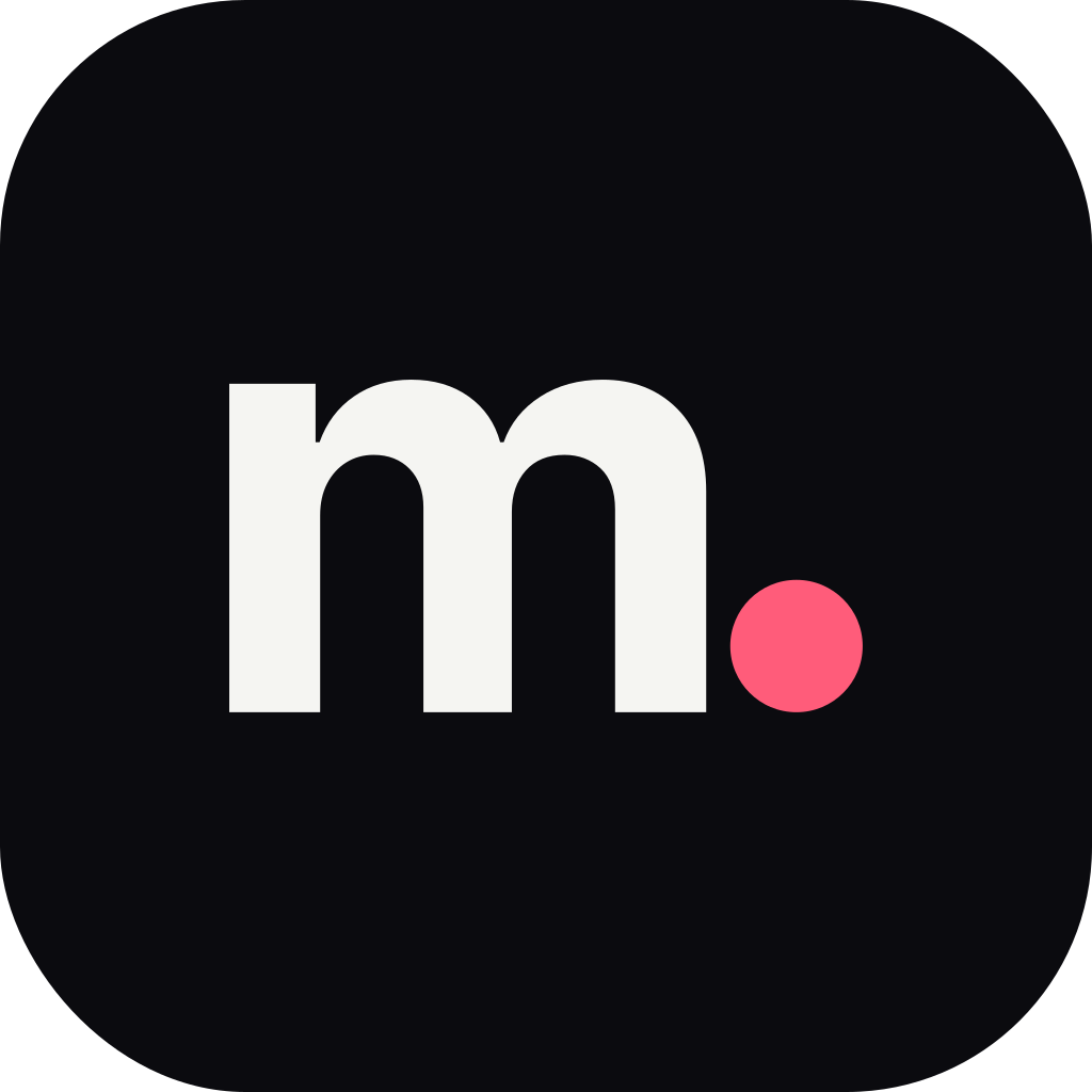
The dot carries the mark on its own at small sizes. Corners are rounded to 22.5% of the width, which matches iOS.







Colour
Three colours. Every other value on the site is a mix of these three, so nothing else needs a name.
Paper
#F5F5F2
rgb 245 245 242
Every page background. Text on it is ink.
Ink
#0B0B0F
rgb 11 11 15
Type, primary buttons, the admin and the closing band.
Coral
#FF5C7A
rgb 255 92 122
The dot. Selection, focus, live markers and attention. Never body text on paper.
- ink-2
- 70% ink on paper
- Secondary text
- ink-3
- 52% ink on paper
- Captions, labels, placeholders
- line
- 13% ink on paper
- Hairlines
- paper-2 and paper-3
- 3% and 6.5% ink on paper
- Frames, hover fills
- coral-deep
- 68% coral on ink
- Coral as text on paper
Type
A serif for what we say, a grotesk for everything we do, and a mono for what the machine says. All three are open licensed and self-hosted.
Instrument Serif
Display, Regular and italic
Headlines and statements. Never below 28px, never faux-bold, italic for a whole phrase at most.
Built end to end, kept running.
Geist
Text and interface, 400, 500, 600
Body at 17px with 1.6 line height. Sentence case everywhere; no letter-spaced capitals.
Web apps, Discord bots, APIs and dashboards for communities, product teams and agencies.
Geist Mono
Code and data, 400, 500
Code, snippets, invoice numbers and latencies. Not a costume for labels.
GET /api/status → 200 · 41 ms
- display-1
- 46 to 96px
- line 0.96
- Page statements
- display-2
- 34 to 60px
- line 1.02
- Section headings, index rows
- display-3
- 28 to 38px
- line 1.1
- Quotes, small headings
- lead
- 18 to 22px
- line 1.5
- Intros
- body
- 17px
- line 1.6
- Paragraphs
- small
- 15px
- line 1.55
- Meta, captions beside content
- caption
- 13px
- line 1.5
- Footnotes
Using the marks
- Keep clear space around the wordmark equal to the height of the letter m.
- Never set the wordmark smaller than 72px wide on screen or 18mm in print.
- Never recolour the dot. If the surface is coral, use the reversed icon.
- Never stretch, rotate, outline for emphasis, or add effects to the marks.
- Coral is a signal, not a theme: one coral object in view is enough.
- No gradients, no glass, no glow. Light on the nova is the only exception.
Have something in mind?
Tell us about your community, your product or your idea. We will come back with honest next steps, usually within a day.